Showing posts with label Colorful. Show all posts

How to Choose the Right Color Scheme for Your Home

A color choice is a matter of personal preference. More often than not, there is a meaning behind our choice of colors.

When you decorate your home or would-be home in case you are buying a pre-selling condo unit, you would want to incorporate the colors that you really want. A downside? Not all colors are appropriate for home designs and décors.

To know whether you are designing your house based on what suits your personality and lifestyle best, here are some practical tips.
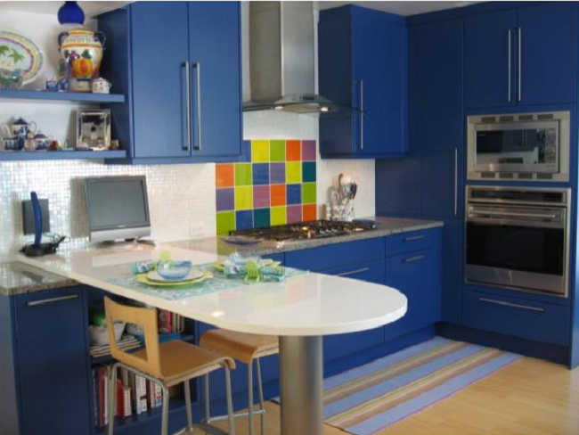
Learn about colors

Learn about colors
Source
Before you step into choosing the colors, brush up your color terminologies first so you won't get lost in the process. First is the hue, which is actually the color. Second is the value. Color value simply refers to either the lightness or darkness of the hue. Third is the saturation. Saturation is described as the dominance of the color. 

For instance, when you mix red with white, the red color becomes less saturated thus, becomes less dominant, resulting to pink color. Fourth is the intensity. This simply points to the color's brilliance. Pure colors are the most intense. Stronger intensity means more dominance. 


Prepare a color wheel

Prepare a color wheel
Source
A color wheel is the single most important reference tool that you can use in deciding for a color scheme. If you want to intensify a particular hue for a specific corner, you should check with the color wheel. If you want to use cool colors then, you simply have to refer to the right of the color wheel for the right visual temperature that you are trying to achieve. You may come up with as many color combinations that you want. You may even create a combination that is truly you and without realizing that these two colors actually look good together.  


Test the color scheme

Test the color scheme
Source
Whether you choose a monochromatic, analogous, contrast or complementary color scheme based on the color wheel, don't forget to test how they look together. You may use a paint swatches, fabrics or poster boards in testing your choices of colors and their combinations. 

Paints are available in sample sizes and can be purchased from your local hardware. If the scheme looks good on the papers, you may consider painting a small portion of your wall to determine how the colors connect for real.


Create a color flow 

Create a color flow
Source
Colors in one area are not the only thing that must connect; the colors on all areas especially the adjacent ones must connect, too. The colors must complement one another. Check how the rooms interact with one another then, starting building the palette from there. 

The process is very easy. If you have a choice of a main color in one room, check its position in the color wheel. You may choose any color beside that main color. This means you have at least five choices for the next rooms. Do the same for the next rooms or areas. 


Consider the lighting

Consider the lighting
Source
Lightings must not be overlooked. There are good reasons why the paint stores themselves keep lightboxes handy. Lights reflect and deflect the colors, which is the reason behind constant changes of colors throughout the day. Natural daylight can show the truest colors. Thus, when choosing a color scheme, make sure that you are doing it in broad daylight. 

Incandescent lights bring out warm tones while fluorescent lights cast sharp blue tones. With this, check the types of lights that you are using or you want to use in the future. Strong colors tend to be overpowering when used beside a huge window. However, you may use these colors on areas that receive no direct sunlight. Think of these as accent walls.


Commit to the palette

Commit to the palette
Source
Infusing colors on the spaces is fun and exciting, and the excitement builds up upon painting from room to room. However, if you are not ready or not sure about the perfect color scheme, you may choose neutral colors instead. Once you get started, you must continue with it. With this, you may simply paint your walls with beige, pale beige, sand, gray, white, ivory, etc. Colors can still be brought in through rugs, carpets, artworks, pillows, tapestries, outfitters, furniture, etc. 


With all these, the most important thing to remember is don't rush things otherwise you'd end up with colors or a color combination that don't jive well. Browse as many paint swatches as you'd like. Visit your local paint store and ask for recommendations. Talk to an interior designer. Browse for inspirations on Instagram and Pinterest. Whichever you do, your goal should be choosing a color scheme that lets your personality and style shine you. Instincts never lie, so take heed.

8 Colour Trends to Follow This Year

Every New Year brings you yet another opportunity to introduce something new and fresh to get your home decor out of the boredom of yesteryear's decoration trends.

Among other elements of change, splashing new colours in your home is one of the most cost-effective yet practical and impactful ways of doing so. That is why we have come up with these "8 Colour Trends to Follow This Year".

1. Though there are different ways of improving the decor of your home, it is about time to realise the fact that "bold is beautiful" and resort to the liveliness and richness of this bold blue hue. The good thing is that you don't find any gloom and dullness in this shade, getting a totally royal and rich ambiance.

Blue Living Room Design
Source
2. If painting a whole wall looks like too much of a labour and pain to you, this works out well enough even in small doses. In fact, the richness and royalty of this bold blue shade is balanced well with the whites and lights around, making it stand out right away.

Stylish Living Room Design
Source
3. Fact of the matter is that most people don't feel brave and experimental enough to go for bold shades in their kitchens, depriving themselves from something really nice and amazing. And of all places in kitchen, kitchen cabinets serve the best for this kind of bold and beautiful splash.

Apartment Kitchen Decor
Source
4. Similarly, you can also dine in regally with sumptuousness of bold blue in your dining room.

Bold Blue Dining Room Design
Source
5. This year around, majority of interior decor experts agree that "Greige is new Gold". Beige? No! Gray? No again! Then what, is the question that must be resonating in your mind right now; well, you can refer to it as brownish gray or grayish brown (whatever appeases you!). Without any doubt, greige is the best of neutrals for 2015.

What makes this shade special is the warmth it oozes out without being too overwhelming, while still keeping the crispness alive. In fact, this is what enables it to help other elements around it really pop up.

Sofa Living Room
Source
6. Kitchen is perhaps one of the best places to try this shade full of subtle but certain elegance, because it is a place most appropriate for certain warmth as well as an element of crisp, which is exactly what this lovely shade is capable of exuding.

Awesome Kitchen Design
Source
7. Rustic is back stronger than ever in 2015. Fact of the matter is that rustic wooden accents have always been one of the main attractions in interior decor, one way or the other. Of past few years when rustic charm has made its way back slowly but steadily, warm and rich look is the thing of 2015. When done correctly, it can spruce up the whole ambiance of a room.

Amazing Design and Decor Living Room
Source
8. When rustic is raw, there is nothing that can stop it from stunning people, making them fall in love with it at first sight.

Traditional Dining Room Design
Source
Conclusion

Life can be so much more fun, joy and colourful if you are willing to put in some effort. Your home is your heaven, so you better be willing and ready to make it look and feel like one!

This is a guest post by Maya Grace.

Creative Renovation of a 3 Room Apartment in Italy

This beautiful attic has 96 square meters and is divided in 3 rooms.
Being a last story apartment has it's ups and downs, the ceiling being a little close to the floor then the other apartments in this building.

The designers had to make good use of the space , and be careful not to waste it. The team's purpose was to make this place a bright and happy place, but also to make it eco friendly.
The apartment is designed for 2 persons, a young family , hence the bright and joyful colors.

Source: Jurnal de Design ; Cose di Casa

Colorful Living Room Design
Source
Colorful Design and Decor
Source
Beautiful Wall Art
Source
Dining Room Design
Source
Transitional Bedroom Design
Source
Girlie Bedroom Interior Design
Source
Beautiful Bathroom Interior Design
Source

10 Unbelievably Colorful Buildings Around the World

Many cities of Europe are the same, when it comes to colors. The grey look and feel of many cities sometimes haunts a tourist even after the trip is over.
We need more color, and we need the courage to paint big buildings in bright and happy colors. Of course, we need to take in consideration the fact that a colorful facade is more expensive to maintain, but I think in some cases it's totally worth it.

In order to inspire and maybe make a change somewhere, we gathered this beautiful collection of 10 Unbelievably Colorful Building Around the World.


1.Carabanchel Building In Madrid, Spain.

Carabanchel 24 Building In Madrid, Spain.
Source

2. Houses in Istanbul, Turkey.

Houses in Istanbul, Turkey.
Source

3. Nautilus: Giant Seashell House in Mexico City.

Nautilus: Giant Seashell House
Source
Nautilus: Giant Seashell House in Mexico City
Source

4. Užupis Art Incubator, Vilnius, Lithuania.

Užupis Art Incubator, Vilnius, Lithuania
Source

5. Ramenskoye Building in Russia.

Ramenskoye Building in Russia
Source

6. Real Life House of OZ.

Real Life House of OZ.
Source
Real Life House of OZ.
Source

7. House In Nippes, Cologne, Germany.

House In Nippes, Cologne, Germany
Source

8. Zamość Building in Poland.

Zamość Building in Poland.
Source

9. Snail Home in Sofia, Bulgaria.

Snail Home in Sofia, Bulgaria.
Source

10. Blue House In Didden Village In Rotterdam, Holland.

Blue House In Didden Village In Rotterdam, Holland.
Source
Blue House In Didden Village In Rotterdam, Holland.
Source
Source: BoredPanda

Pretty Design in a Small Polish Apartment

I love colors, and if you read this blob you should all ready know this and whenever i find projects like this one i get very excited and eager to share them with you.

This beautiful apartment is located in Poland, and is made possible by Shoko Design. With separate colors for every part of the place, it will surely please those of you who love positive energy and optimistic surroundings.

Great Living Room Design
Source
Colorful Living Room
Source
Beautiful Kitchen Design
Source
Kitchen Table Design
Source
Bathroom Design Apartment
Source
Bathroom Sink Design
Source
Amazing Blue Bedroom Design
Source
Beach Styled Bedroom
Source
Second Bedroom Design in Yellow
Source
Beautiful Bedroom Interior Design
Source

550 Square Foot Studio Turned into a Beautiful Colorful Pied-à-terre

Barbara Milner is a TV producer and a single mom, and she lives in Toronto, Canada.
Her new apartment is also located in Toronto, Canada, and it's a new renovation.

Having a small space available, only 550 square-foot (51 m²) turning this into a Pied-à-terre was a given.

The features powerful colors and a transitional design, likeable for everyone.

Colorful Living Room
Source
Beautiful Sofa
Source
Door Details Design
Source
Kitchen Interior Design
Source
Bedroom Interior Design Idea
Source
Kitchen Interior Design Architecture
Source
White Kitchen Clean Design
Source
Monochromatic palette
Source
Source